This article is a guide for web designers on how to become better, how to avoid common pitfalls and how to handle responsive design.
As a web developer, I work closely with many designers and over the time I have noticed that designers struggle with details or Responsive Design theory and how to implement it.
So i thought it was time to write an article to help designers get better, create more performant websites, avoid pitfalls and collaborate better with the developers.
BEFORE YOU START DESIGNING A WEBSITE
DO A RESEARCH BEFORE START DESIGNING A WEBSITE
Before you even start designing a website, you will need to make some research and check the competition. Of course this does not mean that you copy what others do. You will just see what works for your case. For example, having a list of services or a list of benefits in the home page can be beneficial for the user who visits the website.
CREATE A SITEMAP WITH THE CONTENTS OF EACH PAGE
You will find it very useful to create a sitemap, if you don’t have one already. In an excel file, create a list of all pages & sub-pages. For each page briefly write down its contents.
For example, a “Services” page should have the following contents:
- Page title
- Page subtitle
- Page main text
- List of services
- Contact us button
TRENDS
While doing your research you will notice trends that most designers use these days. Keep in mind that some trends will only be around for a while and they won’t last in time. You need a website that will last in time, at least for the next 3 years, unless your client requested something very special or updates his website quite often to catch up with the trends.
So its good to see what is out there but you can’t always use all trends. Specially everything together in one page. You need to think of cohesion and how everything is presented to the user.
The user will need to understand what this site is about the minute he opens the website. He should see what the site / company offers and what it can offer him.
CREATE A WIREFRAME
You will find it very helpful if you make a wireframe for the homepage. You do not really need some fancy tool, just a pen & paper. Note down what the home page should include and decide on the hierarchy of the contents. The most important section should go at the top.

EVALUATE YOUR CONTENT AND SITE USABILITY
Always evaluate your content & design progress as a user. Take a step back and look at your design. If you were a common user would you understand what this website is about or why this section needs to be here? Does it make sense? what would you change? If you are not sure you can always ask a colleague what he “sees” on the design you have made so far.
Check for redundant images, unnecessary information and even redundant sections.
Anything that does not belong in that page, it should be removed. This way you end up with a clearer & faster website.
START DESIGNING A WEBSITE
DESIGN WIDTH & GRID
Set your design (canvas) width at 1600px – 1700px. It has proven to be “safer” for responsive design.
Then place your grid inside that canvas. If you use a wider canvas you will most probably end up adding too many elements, that you won’t be able to fit in smaller screen resolutions, such as a tablet or a laptop.
You may also read this article called Responsive design Guide that is very helpful on how to get started with grids, gutters and responsive design in practice.
Always remember that the gutter should be the same everywhere, even on mobile devices.
MENU DESIGN
It is very common to use a burger menu for the main menu nowadays. Specially when working with responsive design. Yet, it is a good practice to keep the crucial / major page links somewhere that are always visible, outside of the burger menu.
For example, the “view cart” link on an eshop should always be visible. Likewise, the “Projects” link for a portfolio website is best to be visible as well. Find these crucial links and place them somewhere that are always visible.

It is advisable that those main links are listed at the footer as well (footer menu).
CONTENT
Think about functionality first. Your design should support functionality and serve the client’s purpose, eg increase in sales.
Always remember that people scan – they do not read. Split big chunks of text by adding titles between them and use bullet points whenever applicable.
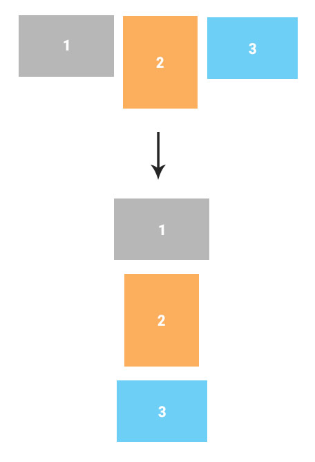
After designing each section, always check how this element will fit in smaller screen resolutions, such as tablet & mobile. Remember that the HTML hierarchy defines the order in which each element will show in the mobile screen, at least in most cases. You can always ask advice from a developer if you are not sure.
Also review your design as a user: does this section make sense? Will the user understand how to interact with it?
Color contrast & sizes
Always check the color contrast. For example grey text on grey background does not always make a good color contrast. Many people will find it hard to read that kind of text.

Avoid using a very small font size. The user should easily read the body text. Keep a minimum 14px – 16px font size, depending on the font used.
Additionally, avoid using a very big font size in big chunks of text, unless you know what you are doing. Always check that such content will fit the page & screen resolution.
Think about your client: what if the client changes that big title of yours and place a whole sentence? How will it fit in smaller screen resolutions?
Keep in mind that titles & text will change by your client when he finalizes the website copy.
You may have predicted a paragraph somewhere in your design with a specific styling, however the client might end up using just a sentence or 4 paragraphs of text instead. So you need to wonder: Will such a change cause problems? Will it fit in that position?
Always think of how the content extends.
HOVER EFFECTS
Hover effects should only be used on clickable elements. If an element is not clickable, then it should not change when the user puts his mouse over it.
Unless there is some fancy WebGL animation in place and it is done on purpose.
Respectively, a clickable element must have a hover effect, such as a background color change, to indicate that it is in fact clickable and something happens when the user clicks it.
Always ensure that clickable elements look clickable.
THINK ABOUT THE USER AND SITE USABILITY
Avoid using video auto-play on mobile devices. You will end up “eating up” all of the user’s bandwidth.
Always consider what info the user should see when visiting a page from his mobile device. It is a good practice to completely hide sections that are not needed or even some images & videos. This way, the page will load faster and the user will not have to scroll through unnecessary content.
POSTS & POST TYPES
In cases where a website features news, projects, portfolio, blog, etc, then it has post types. Foe example, a project or a blog post is a post type.
Ideally, the design for each post type should be the same throughout the site. This means that whenever we have a list of posts they should have the same design & styling: a layout in 3 columns with specific image size, title font & size etc.
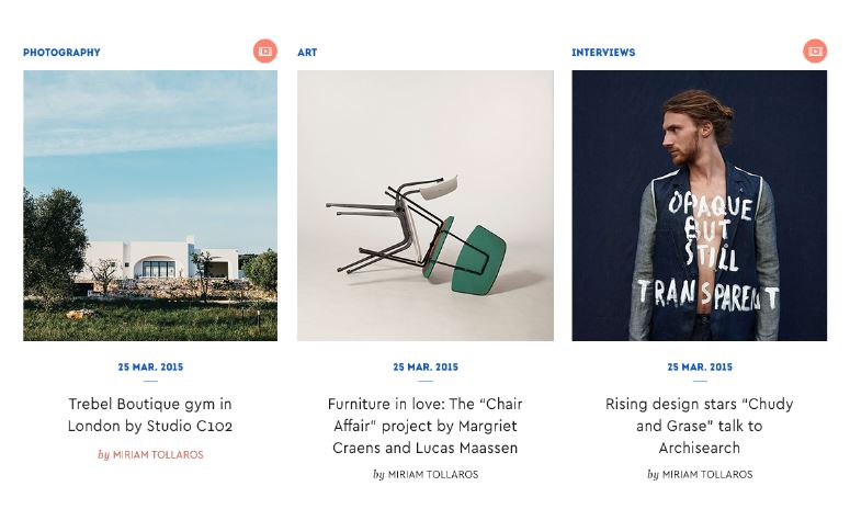
Of course we can have different styling for the projects list and a different styling for another post type, such as a blog post. If you have to, you can have a second design for a post type, however you will need to stick with the same image ratio.
As for the thumbnail used (image ratio mentioned above), it should have the same ratio as the main image of the post. What does this mean? Let’s say you are about to design a list of blog posts. You should first consider how the post single page will look like and the size of the main image used. Then you resize this image and use it in the design of each post inside your list.
IMAGES
I see many designers who tend to design a background image with a title & text over that image.

In this case there are a few things to consider:
- What happens if your client selects a very light colored image and you have designed it with a white text? An image overlay color or gradient will save you in such cases.
- What happens if your client adds a whole sentence or paragraph over that image? does it fit?
- What happens in smaller screen resolutions? The image keeps its ratio as it gets smaller. Does the text still fit over that image? If no, there are 2 options:
a) Move the content under or next to the image or
b) keep the text over the image for desktop devices and move the text under for tablet & mobile devices.
Avoid using too many images, especially in sections or blocks of content where you know that you will most probably end up using a very generic stock image.
Generic stock images that many sites use, specially the ones showing people, do not matter for the user.
CAROUSELS
Statistics show that only 1% of the users will click through or interact with a carousel. This is a very small number of people: only 1 out of 100 people.
So you need to be aware of the elements you choose to include in a carousel. It works fine for a photo gallery, but not for useful information that the user should see, such as a services list or a list of benefits.
FONTS USED IN THE DESIGN
Use up to 3 webfonts! No more than 3, as page speed & page rendering is something that both designers and developers should care about.
Keep in mind that by using 2 different weights of the same font family, means that you are using 2 webfonts. So for example, Ubuntu regular is 1 webfont and Ubuntu bold is another webfont.
You can use as many system fonts as you wish. You just need to be careful of which of them are supported in different operating systems. CSSfontStack is a good reference on system fonts and their support on different operating systems (Windows, MAC).
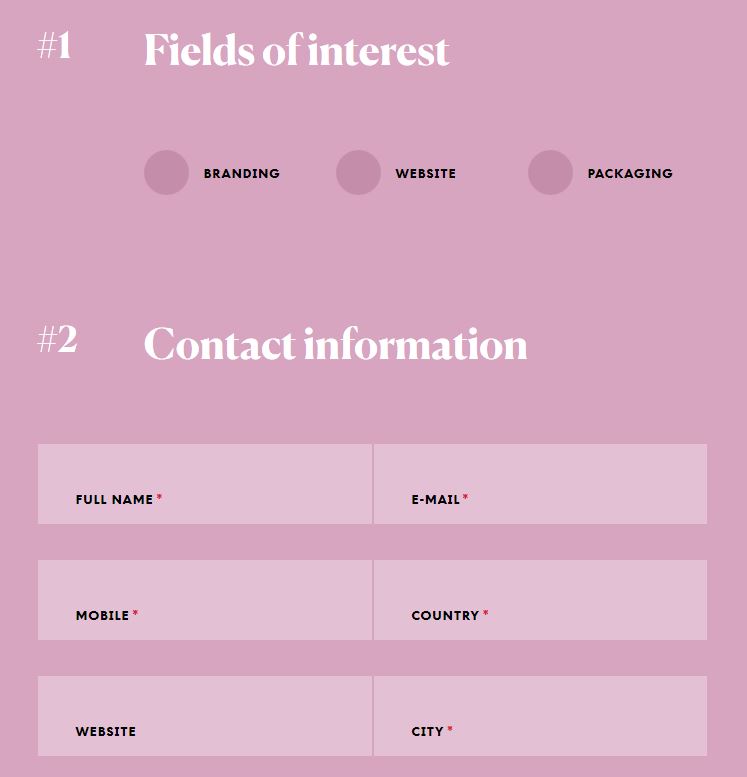
FORMS
Always use labels for each field. This is the best practice for both the UX and screen readers used by people with disabilities.
Group all related fields, specially if you design a big form with many fields. For example, group the user details and any other details you ask from the user (eg project details).
Also arrange the fields according to their relevance, eg a “city” field should be followed by a “country” field.
Avoid using different fields for first name & last name, if possible. Use only one field instead, full name.
There are many countries that people have complicated names to fit in 2 boxes or have particularities. For example, if you’re from Latin America, chances are that you have two last names, one from each parent. If you’re Chinese, your family name is first, personal name is last, and they’re always used together. You can read more about it here.
If you have a very specific target audience that is limited to a specific country, for which you know the naming rules, you can have two different fields for the name.
Users get bored of filling forms, so always use the minimum set of fields on each form. If you ask for more info, the user might not fill in the form at all.
If the user has to agree with a set of terms before submitting the form, specially nowadays with the GDPR, include an acceptance check box just before the submit button. Make sure the user understands what the terms are. A link to a terms & conditions page or privacy policy page should exist.
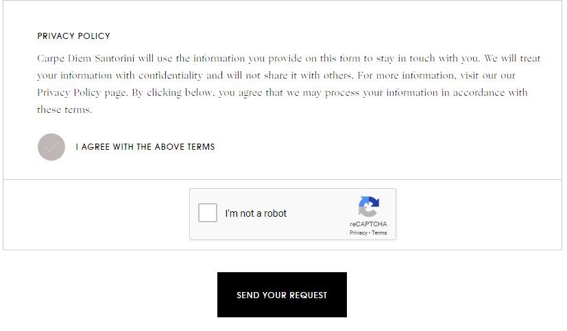
All buttons should have a clear context and should not have a generic text. It is very common to design buttons like “submit”. However, it is best to explain to the user what is button does, eg “Subscribe now”, “Register now”, etc.
Be aware of the colors used for a button. For example, if a button has a red background color it conveys a “danger” signal to the user and he will consider it twice before he clicks it.
SEO
SEO stands for Search Engine Optimization and plays a major role for all websites. Everything on a website counts for its SEO: images, text, headings, page loading, internal links, etc.
Of course a designer is not an expert, but you can anticipate a few things when designing:
- All pages need a Main Title.
- All pages need a Subtitle.
- All pages need a main Text of minimum 1 paragraph or more.
- If you have many text blocks on a page, you can produce meaningful titles for each section / block.
- You should keep in mind the page load & speed. The faster the website loads, the better for your users and the SEO.
For the website home page:
You need to include the most important information from the inner pages of the site:
- Does this website feature products? You should have a section with promoted products & a “call to action” button, such as a “find more products” button.
- Does this website have services? You should include them in a bullet list with a respective “call to action” button.
- Does the client what to increase the requests on new projects? You should include a “Contact us about your project” call to action button.
You get the point.
So apart from links to inner pages and the main SEO text, the home page should have limited links to external websites & secondary pages.
So for example, if you have a “latest news” section, and each post mentions its category or author, the category & author should not be linkable, unless otherwise requested by the SEO team.
STYLE GUIDE
Nowadays, big companies or very large websites & applications have a style guide. A good example is the style guide used by AirBnb.

For a small or medium website it is optional, however it will help you to keep track of the styles used: font family, font weight & style, font size, colors, etc.
You do not need to use some fancy tool. Instead, you can just create a new design / page with all the styles & colors in it.
You will find it useful to go back to it and get a style or a color directly.
It will save you time when designing new sections on the site, as you won’t have to look around to see what font size & style you used before in other pages. It will also help you create a more universal styling for your project.
The developer who will take over the project will love you for it, too!
Lastly, be consistent when designing elements. You do not want each page to look completely different from the other pages on the website.
DEVELOPER HAND OFF
When the time comes to hand off the design to a web developer you will need to prepare designs, webfonts (if they are not free) and SVG icons.
You should properly name your layers in your designs.
You should avoid rasterized layers in Photoshop so that the developer can easily see the style set: stroke color & width, font used, color used, gradient colors, etc.
Before the developer starts with the project, you should brief him about every section & page. Use comments on your design wherever appropriate.
You will also need to prepare:
- all hover effects
- designs for smaller screen resolutions (eg tablet & mobile), at least for the major elements, such as the header & menu, footer etc.
And a last note that goes for both designers & developers:
Motion & animation should have a purpose on a website. Don’t overdo it and don’t animate all elements while scrolling. You do not want your user to feel dizzy! You need the user to live an experience.