RESOURCES & DESIGN GUIDE
Lately i had some time and i wanted to update the design on my blog in order not to use images as thumbs for every post.
And this actually was proven to be very had. Mostly because i suck at choosing and pairing colors, fonts etc.
So i started searching everywhere for resources and guides to help me understand some basic concepts on design and get me started.
These resources turned out to be a lot, so i though i should make a post about Design Guide and share it as a reference for me or anyone else interested.
I will also make this post more generic, helping someone to create a design from scratch.
STEP 1: KNOW YOUR PROJECT BEFORE YOU START DESIGNING
The very first step in Design, is to understand your project and the needs: Ask your client anything that will help you to best identify the project and its needs.
An example of questions for your client:
- What is your company motto?
- What does your company do?
- What is the size of your company?
- What is the product / service / purpose of the company?
- What would you like the site to do? What is its main purpose? (eg selling products online, having a corporate website or a portfolio website)
- Who are your competitors?
- What do you offer that the others don’t?
- What does the competition offer that you don’t?
- What makes your company unique?
- Who is your audience or target market?
- What colors do you like?
- What colors you do not like?
- Please provide some links of websites that you like i terms of design.
- Will website copy come from a copywriter? Is a photographer taking photos?
- What is the deadline?
- Do you have a budget?
This is a list of questions i gathered from various sources like:
- How to write a good project brief
- Website brief by project-brief
- Basics of a good design brief
- Writing an Effective Design Brief
From this brief analysis you should understand the project, it’s needs, target audience and purpose.
2. DESIGN RESEARCH & MOOD-BOARD
Search online for design inspiration. You may find an image that will trigger your imagination or you can even find inspiration from a section of a website.
Some design resources to get you going:
- dribbble.com
- behance.net
- codepen.io
- siteinspire.com
- canva.com/ideas
- theinspirationgrid.com/category/design
- abduzeedo.com
You can gather your images, screenshots and design ideas on a moodboard. For this you can use pinterest, a folder on your computer, gomoodboard.com or any other tool you like.
3. SPECIFY THE CONTENTS
Afterwards, you should specify the contents of the website. Create an excel file and add the pages that this website has in one column and then add the contents for each page in an other column.
The first time you make it, it can be hard, but all you have to do is think as a visitor of the specific website:
- What would you like to see on the website?
- What actions would you like to be lead to (eg contact the company or buy a product)?
Then you have to think as the owner of the company:
- What would you like the visitors to do on your site?
- Subscribe to a newsletter?
- Find a specific information?
- Buy a product?
- Contact your company?
You can also see what the competitors are doing on their website in terms of content and Call to Actions.
Now you can update your contents according to the above info.
For example, an “About” page should have the Company info but can also have a list of the team members, a link to the contact page and a link to the services page.
There is an online documentation that provides you with steps for the process you may take when starting to design a new website:
There is also a process that will help you out with the agreement between you and the customer.
4. GATHER THE CONTENT OF THE SITE
Your client may have high resolution images and texts that he or she would like to use on their site. That’s rarely true, but if its the case the gather the content: images, texts, videos, testimonials and anything that will help you get going.
Most of the times you will need some stock images to use on your design. I have gathered some free resources on stock images below:
- unsplash.com
- pexels.com
- stockio.com
- stocksnap.io
- pixabay.com/en/photos
- pikwizard.com
- photos.icons8.com
- lifeofpix.com
And some that are not free but offer premium images
Also, here is a resource for sounds in case you need one orangefreesounds.com
Some beautiful illustrations: https://undraw.co/illustrations
And a useful graphics / mockups source.
Also, a triangle background generator: trianglify.io
5. SPECIFY THE TONE OF VOICE & MOOD
Now it is going to be easier to specify the tone of voice: should it be fun? formal? casual?
It actually depends on the company and the project. A website about a lawyer is formal with darker colors and a more serious look. A fashion blog is mainly white with big typography and a casual feel. A website about a kinder-garden is cheerful and playful with vivid colors. And so on.
Now it is going to be easier to select colors & fonts. They have to fit the website’s mood and tone of voice. You should note that every color and font has a personality.
6. CHOOSING COLORS
When designing, this is the most difficult part for most people. Colors have a personality and so they should convey the mood as you specified it above.
There is the classic color wheel, which personally i understand in theory but couldn’t really use it, until i found the image below:

And also a very helpful graphic:
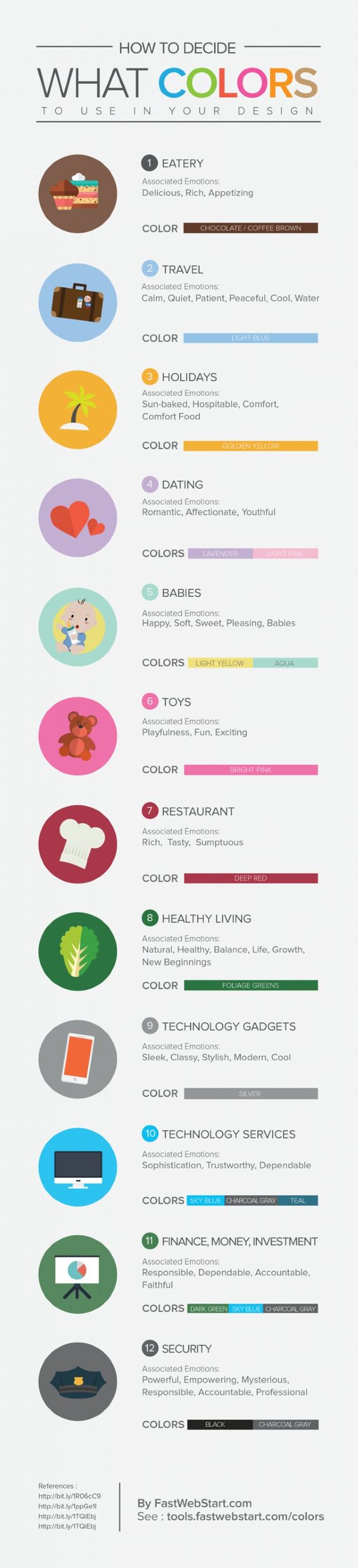
There are many more so i gathered them on a Pinterest board which i continue to update whenever i find something interesting.
Colors also have a different meaning for some cultures. Here is an article about color symbolism by culture.
Now let’s say that you are making a corporate website and you would like it to have a blue color.
What colors should you combine it with? What hue should you use?
Don’t worry, you can actually find many color combination tools online such as:
- color.adobe.com/explore
- Data color picker
- designschool.canva.com/blog/brand-color-palette
- colorhexa.com
- colorhunt.co
- colors.cafe
- canva.com/colors
- canva.com/colors/combinations
- coolors.co/app
- colormind.io/bootstrap
- colorbook.me
- Open Color Library
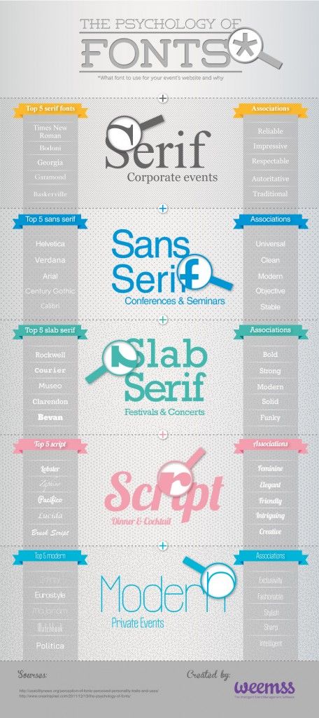
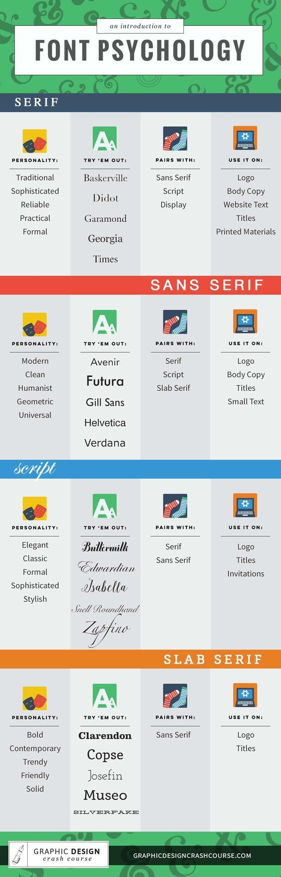
7. CHOOSING & PAIRING FONTS
Fonts have their own personality. Yes, choosing colors was not hard enough.
The diagrams below will help you understand what font style to use in your design:
Now that you got the basics, you can start searching for a font to match your design.
Here are some font inspiration websites:
typ.io is my personal favorite: It gives you the ability to search for a specific font and will give you ideas, examples, what font to pair this with and also propose font size for the heading and the body text.
You can also search by tag, eg “portfolio” or “tech” and has lots of examples of how the fonts are being used and paired.
Where to get a font?
- fonts.google.com
It is a great place to start. All fonts are free and they are sorted by popularity so the first ones cannot be so wrong. It also gives you the ability to add filters and add your own text as a preview. - fontsquirrel.com
- dafont.com
If you are not sure about a font combination, stick to the same font family and use different weights. For example, use Roboto Thin with Roboto Regular – they are actually designed to work together. In this case, you might want to skip a weight: eg use Roboto Regular with Roboto Bold (we skipped the Medium weight).
In order to convert a font to a Webfont you may use the Fontsquirrel’s Webfont Generator.
A useful tool to help you with the CSS font stack in your CSS: cssfontstack.com
You may find more typography resources gathered in one post.
8. WHERE TO FIND ICONS
Now that you have all you need, you will probably need some icons to match your design.
Here are some resources on icons:
But you have to keep in mind to use icons that really work together. You cannot have a a bold solid icon with a thin lined icon. All your icons need to have the same style.
9. GRIDS
When you start your design, you should specify a grid where your content will spread in.
There a re a few grid generators to help you get started:
If you do not know how many columns to choose, it is best to stick to 12 columns as it will give you more options: 2 columns, 3 columns, 4 columns etc.
I have also written a post on ResponsiveWeb Design that explains grids and how to use a grid.
10. E-BOOKS TO GET YOU STARTED
11. USEFUL ARTICLES
10 cheat codes for designing User Interfaces
7 Practical Tips for Cheating at Design
12. TIPS
If you find it difficult to start designing, start with the contents: just place them on your Photoshop page and then slowly start adding fonts and colors.
You should always remember that people don’t read – they scan. So you should avoid having lots of text on a page, specially on the homepage. Instead you may use graphics, bullet lists and use proper headings for every block of code where possible. Visitors will mot likely read the headings of each section and see the images, maybe even read the bullet lists, so you have to make them understand the website and its purpose just from those elements.
Set clear call to actions: buttons, banners, links, forms and anything that leads your user to an action. Avoid a generic “Submit” title on buttons and describe the action of the button, for example “Subscribe now” or “Create an account”.
When using forms, make signup easier. Use as less fields as possible. Users are bored to fill in forms or may not want to give away that many information about themselves.
Avoid using different fields for first name & last name: there are quite a few countries that do not use their last name like most European countries do or they do not even have a last name.
For the form reply messages use proper colors: red for error messages and never for successful reply messages.
Use a proper line height for your text & titles. When in doubt use 1.5em – meaning 1.5 times the font size. So for example if your font size is 16px the line-height should be 24px. This gives enough space between the lines of your text block and makes it easier for people to read.
After you finish your design or when you are not sure about the result, step back, zoom out and check what you have created. This way it is easier to spot inconsistencies or things that should change or get toned down.